Prompt recipes
AI Personal Journal Cover Prompts with a Clear Focal Point
Design a journal cover around one motif, readable title space and the final crop, with three complete prompts and a practical cover inspection pass.
By Onhand Studio · September 16, 2026 · 5 min read
Choose the motif and title together
A personal journal cover works best when one image carries the idea. Choose a motif connected to the journal: a plant for seasonal observations, a path for travel notes, an abstract shape for a general notebook. Then write the exact title you want to add. The length and position of that title determine how much quiet space the illustration needs.
Decide whether you are making a digital cover, a printed front panel or a full wrap for a bound notebook. These prompts target front-cover artwork. A full wrap also needs the correct spine, back and production dimensions from the notebook supplier. Do not stretch a front-cover image across the entire wrap and assume the focal point will land in the right place.
Sketch a simple arrangement: title near the top, image below, optional name at the bottom. You can change that hierarchy, but make the decision before generating. If you want no title at all, the motif can occupy more space; it still needs breathing room around the final crop.
Start with one plant against a calm field
Botanical journal
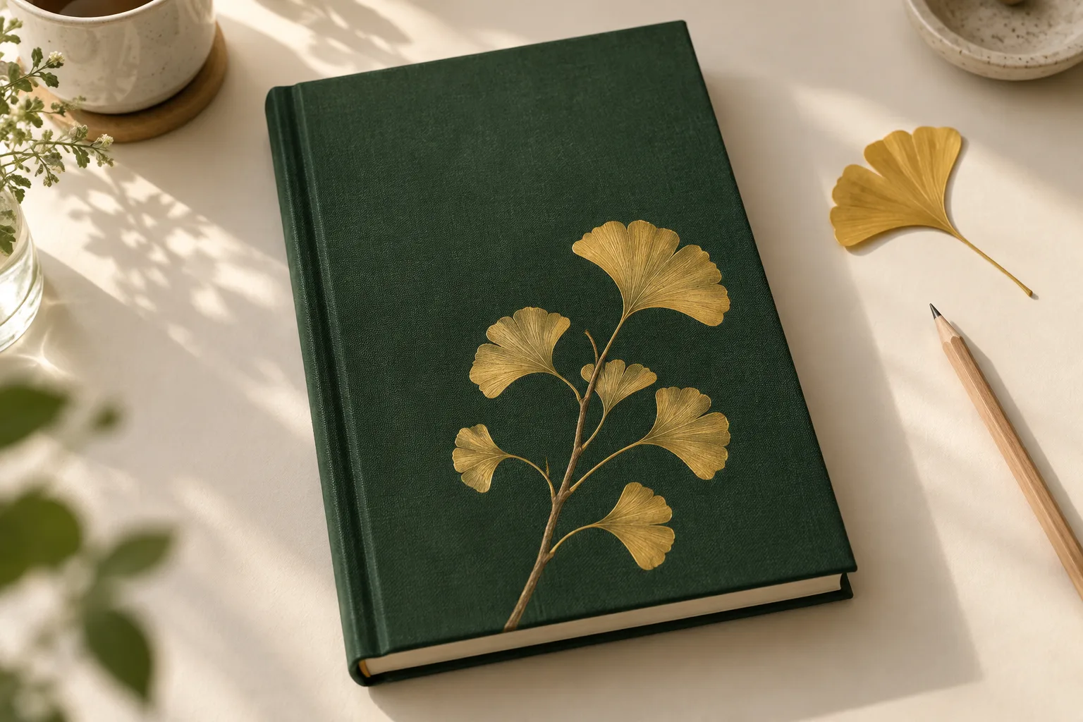
Portrait journal cover, slender ginkgo branch rising from lower center, golden fan-shaped leaves, forest green background, clear upper quarter, painted leaf veins, soft even light, generous space beside branch.
The branch gives the eye a single route through the cover. The open upper area holds a short title later. Leaf veins are secondary detail; if they become scratchy or overpower the overall shape, simplify them. A successful small cover should remain identifiable from the branch silhouette and color relationship alone.
Two different ways to organize the same page
Travel notebook
Portrait painted journal landscape, ochre path winding from lower edge toward distant blue hills, broad pale sky in upper third, sparse dry grass, soft gouache texture, muted colors, simple shapes.
Abstract everyday journal
Portrait abstract cover artwork, one large softly edged terracotta oval slightly below center, two small muted blue curved shapes near its lower edge, warm ivory background, broad clear space above, matte painted texture, balanced asymmetry, restrained palette, large uncluttered color areas.
The path creates depth and direction; the abstract version gives you a strong color block without attaching the notebook to a specific subject. For a series of yearly journals, keep the composition and medium stable while changing one color or motif. Add the year with real type so the labels stay accurate and easy to update.
Place the real title before judging the cover
Add the title in a layout tool as soon as you have a plausible image. A cover that looks balanced without words can become top-heavy once the title is added. Test the longest line at the intended size. If it crosses the branch or hills, move the image or choose a quieter composition rather than squeezing the lettering.
| Problem | Useful correction |
|---|---|
| The model adds fake title lettering | Generate only the illustration and remove accidental marks before placing real text. |
| Several objects compete for attention | Keep one motif and remove supporting objects from the prompt. |
| The focal point sits too near a trim edge | Request more space around it or adjust the image inside the supplier’s template. |
| Fine texture makes the title hard to read | Use a calmer upper field or a simple title panel. |
| The cover feels empty after adding the title | Adjust the motif scale or title placement before adding decorative clutter. |
Retain the clean illustration separately from the finished cover layout. That lets you change the title, date or notebook dimensions without having to remove text from a flattened image. Keep a copy of the final crop as well, especially if the same cover will be used digitally and in print.
Inspect the final front cover at actual size
Look at a small thumbnail first: the cover should have one clear focal point. Then inspect the full layout for defects and spacing. For a printed notebook, use the supplier’s final template and review a proof when possible, including the area affected by binding or trimming.
- The motif remains recognizable at a glance and at thumbnail size.
- The exact title, name and year are correct and comfortably readable.
- The illustration leaves enough space around the words and trim edges.
- Stray lettering, malformed leaves or inconsistent landscape details have been removed.
- The final dimensions match the digital destination or notebook template.
- A separate clean artwork file and the finished cover layout are both preserved.