Prompt recipes
AI Material Reference Prompts for Game Environments
Explore stone surfaces, weathering and lighting for game environments, then separate material ideas from shadows baked into a generated reference.
By Onhand Studio · September 16, 2026 · 4 min read
Choose which material decision you need to make
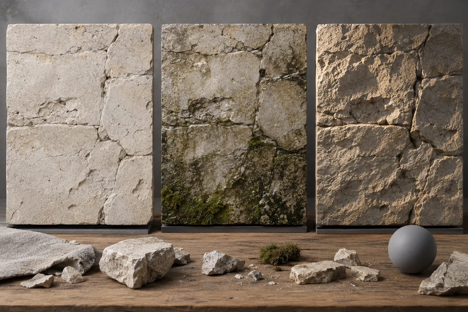
Use a generated texture reference to compare surface character: broad limestone joints, flaking painted steel or wet river stones. Keep the first study focused on one material and one condition. The image can help you decide how a surface should look before you build or select the textures used in a scene.
A reference picture contains the appearance of material under particular lighting. Highlights, shadows and reflections are mixed into its colors. It is not automatically a seamless texture or a set of physically based rendering maps. Treating it as a visual study keeps those lighting effects from being mistaken for properties of the material itself.
Start with a wall section in even light
Starting prompt (proposed, not a tested output)
Material reference, limestone wall filling frame, front view, broad irregular horizontal joints, shallow edge chips, darker stains below joints, even overcast light, beige and gray, consistent block scale, visible surface detail.
The front-facing view reduces perspective changes across the sample. Overcast light is intended to make the color and wear easier to compare. It may still produce shadows that belong to the depicted scene. Inspect whether a dark patch represents a stain, a recess or illumination before using it as a color reference.
Write the material scale beside the chosen image: large wall blocks, small paving stones or fine aggregate. The picture alone may not make that scale clear. If the joints widen gradually across the frame, the reference is changing scale or perspective and will be harder to interpret as one consistent surface.
Separate surface condition from lighting direction
Variant: a damp lower wall
Material reference, limestone wall filling frame, front view, broad horizontal joints, damp stains at lower edge, small moss patches in recessed joints, dry pale stone above, overcast light, consistent block size.
This version changes the distribution of moisture rather than the whole material. The lower staining and recessed moss suggest a location within the environment. Compare where the marks accumulate. Random green patches on every exposed face communicate a different condition and may need to be removed from the direction you give the environment artist.
Variant: a surface under grazing light
Close front-facing study of the same kind of pale limestone blocks, shallow chipped edges and broad mortar joints, low warm light falling from the left across the surface, small directional shadows revealing relief, neutral stone colors beneath the lighting, consistent block scale, no surrounding architecture.
The side light makes relief easier to discuss, but it also makes the image less suitable as a clean color reference. Compare the chipped edges with the overcast study. Because these are separate generations, the stones will not necessarily match. Use them to compare lighting ideas, without presenting the pair as a controlled measurement of one physical sample.
Identify information that belongs to the scene
- A bright spot looks metallic: check whether it is a painted highlight in the picture. A reference highlight does not supply a measured roughness value.
- Joints change size across the image: ask for a flatter view and consistent block scale. Choose a sample with enough repeated structure to compare.
- The sample has a visible vignette: separate the darker border from the intended material color. Do not spread that shading across a whole surface by accident.
- Repeating the image reveals a seam: treat it as a reference and author the tile yourself. The word seamless in a prompt does not verify matching edges.
- Fine grain becomes speckled noise: prioritize large material features and inspect at the expected viewing distance before adding microdetail.
Record the material decisions the reference supports
- Is the physical scale stated separately from the image?
- Are color, surface relief and illumination distinguishable?
- Does weathering collect in places that fit the intended setting?
- Have perspective, shadows and edge shading been identified?
- Is the image clearly labeled as a material reference rather than a validated texture map?
Keep notes such as broad joints, low contrast, chipped upper edges and staining near the ground with the selected study. Those decisions can guide texture authoring or the selection of photographed materials. Build and inspect the actual surface in its rendering environment, where tiling, light response and distance can be evaluated on the geometry that will use it.